本文由OPEN編輯部撰寫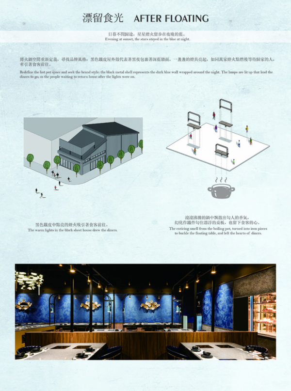
設計概念 DESIGN CONCEPT
日暮不問歸途,星星燈火留步在夜晚的藍。弄木人文空間設計 莊舒云 設計總監、劉文婷 總經理 為 鍋物店 重新定義,尋找品牌風格,在餐飲空間林立的精華地帶,以鮮明意象對比,植入視覺記憶點——黑色鐵皮外殼象徵黑夜包裹,內裡貼以雲彩般流動的藍牆,一盞盞燈具亮起,如同萬家燈火點燃,牽引食客前往。
At dusk, wallowing in the blue night beneath shining stars and streetlights, forget the way home! Nong Mu design Joye Chuang design director and Celine Liou general manager redefine the hotpot restaurant for setting up the brand style. As situated in the prime location where the dining stores stand, hence adopt the distinctive contrast elements to implant stunning visual memories. The black metal structure seems embraced by the night, and the floating cloud figures on the blue wall inside, comply with the lamps light up, full of homey atmosphere that inviting the diners to come.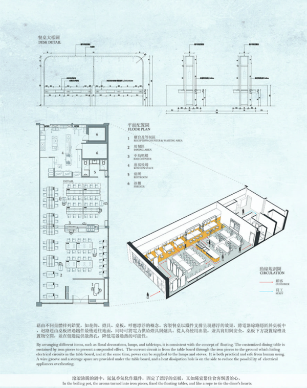
室內運用動線鋪排層次,引領顧客心情上的漸進轉換,行步之間,反覆回味。座位劃設疏密有間,延展空間坪效,形構舒適的餐食互動,讓服務人員與用餐者間彼此安放心緒,無形中環扣串連,升騰的溫度隨著人流,冉冉散開漸行漸暖。
We exploit the varying flow of the interior layout to lead the customers to change their mood gradually. With different table boards to enlarge the floor effect, further, the servers and the diners both feel ease, as well to create the comfy interaction among the meals. The rising temperature gently warms up with the flow of people.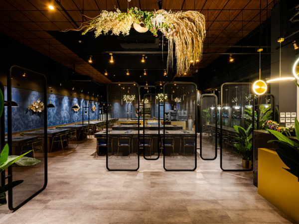
視覺拓延 傳遞信息 Visual extension transmitting information
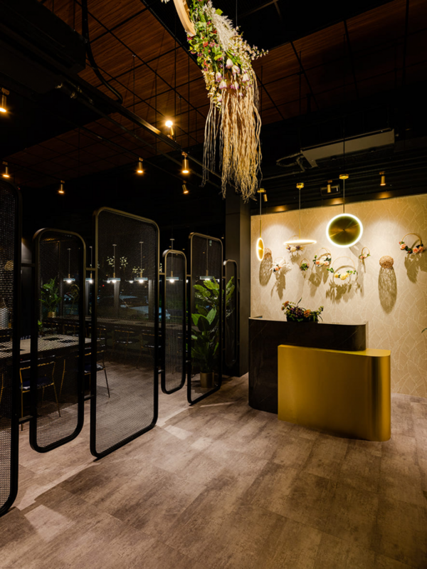
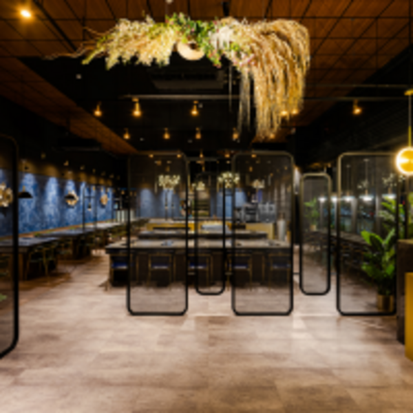
入口處以手作巨大花飾懸吊空中,將視線匯集中心,透過網狀隔屏呼應同一軸線的設計燈具,似煙火綻放後墜落吧檯上方,向四周漫開成為走道。
The hand-made huge floral ornaments hang at the entrance, converging the line of sight in the center of the space, consistent with the design lamps of the same axis through the mesh-screen, which seems fireworks blooming and falling above the bar counter, then diverge into the aisle after diverging to all sides.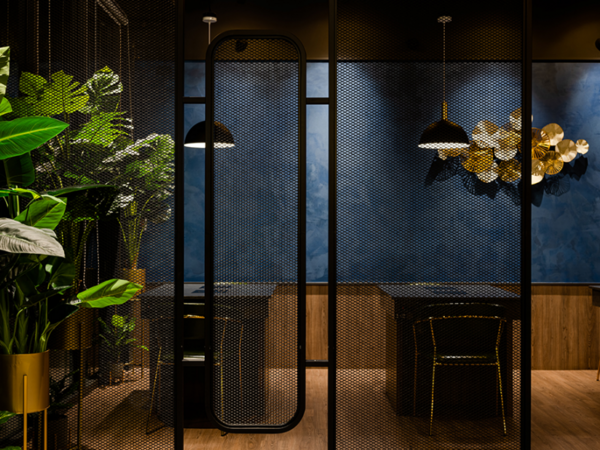
網狀隔屏交相組構,分隔人潮動線,建立用餐隱私,若隱若現拓延視覺。飲料吧及著料台當央而置,直至燈源投射下的設備肉櫃,使觸目所及產生連結開啟味蕾。
The mesh-screens not only well arranged the flow of people, moreover provide the dining privacy and faintly create penetrate vision. The beverage bar and the seasoning stand are placed centrally, the taste buds will be stimulated by looking at the bright meat cabinet.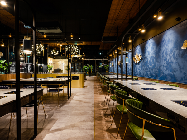
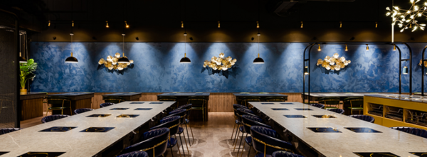
地坪以木、石兩種紋理拼接,嵌入金色鋁條暗示動線,特製的皮質餐椅亦採藍、綠分色,相異質地色調劃分場域範圍,層次漸進指引行進方向。整體空間計畫,透過餐前等候的感官鋪墊,筆直而入展延串連,期待感應時而生。
The floor is spliced with stone texture and wood grain, inlaid with golden aluminum strips to imply the direction of the flow, the custom leather seats also make use of blue and green tinge; by way of different texture and hues to divide the space very well. The overall spatial scheme makes people looking forward to savor now and then.
動線鋪陳 環扣心理 According to the requirements to layout the flow
空間佈局將用餐區與廚房後場劃分為兩大區塊——醬料吧檯置於餐區中央,肉櫃則作為視覺端點,再以牆分化廚房後場,使兩者動線有所區隔分界。確立中島位置後,動線由兩側延伸,座位並列而設、疏密有致,依照需求鋪排為單人、雙人及多人座位區,場域坪效發揮最大限度,供以服務人員及用餐者,彼此自適的使用空間。設計由局部至整體捕捉空間行為心理,讓不同角色的心緒皆被關照,形成良善循環。
The layout divides the dining area and the kitchen space into two large blocks: the sauce island is placed in the center and the meat cabinet that services as the end view of the dining area. Differentiate the kitchen with the wall, so that the circulations are separated and delimited. After establishing the central island position, the flow extends from both sides, and the seats are arranged according to the needs that divided into single, double and multi-person, hence as well as creating the maximum usage effect of the floor. Accordingly, the design of the spatial configuration captures the psychology of customers' behavior, and at the same time meeting the servers' and the diners' needs, so as bringing about an inviting circumstance.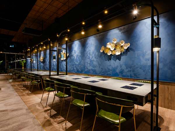
桌體懸浮 預埋迴路 Floating table and invisible circuit form the tidy vision
避免敞朗格局下,餐區整體過於空曠,餐桌部分採以懸浮、落地相異形式,形體各異的桌板,創造出層疊遞進的視覺效果,隱隱區分個別單元,象徵由載浮載成到逐漸穩定的心境轉變。
In view to avoid the empty perception of the open pattern of the dining area, the dining tables are in different forms of suspension and landing, and the different forms of table boards create the layering visual effect, which symbolizing the process of the mood from wandering to gradual stability.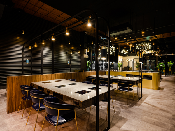
從人為使用角度出發,於桌板下方設置線槽及置物空間,並在側邊設計散熱孔,降低電器過熱的可能性,兼具安全實用機能。架高桌體結合鐵工、木工、燈具三方複雜工序,預埋迴路精準落點,線路由桌板經過鐵件通往地面,涵構出輕盈通透的俐落視感;滾滾沸騰的鍋中,氤氳香氣化作鐵件,銜住了漂浮的桌板,也繫住了食客飄盪的心。
A wire groove and a storage space are provided under the table board, and a heat dissipation hole is designed on the side to reduce the possibility of overheating of electrical appliances, which has both safety and practical functions from human using. The elevated table structure via the complex processing of ironwork, carpentry and illumination, accurately embedded the circuit, and the current circuit is from the table board through the iron pieces to the ground, forming the concise and transparent sense of vision. In the boiling pot, the smell turns into iron pieces, fixed the floating tables, and like a rope to tie the dinners' hearts.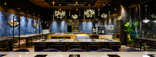
天頂弱化 調配燈距 Reduce parts of the ceiling and well adjust the distance of lamps
建物本體屋高八、九米,為克服原鐵皮挑高結構,適度降低天花高度弱化距離,以減少冷氣空調耗能,並透過木作天頂跳色,藉暖意木質柔和剛冷黑幕,高低層次下產生趣味變化。燈光設置則選以軌道燈垂降,引導視覺集中餐食,藍夜中點點繁星,織就靜謐好食光。
The structure of the building is about eight to nine meters high; in view to overcome the original metal high structure, we lower the ceiling to weaken the gap, as well reduce the energy consumption of air-conditioning. And then exploit the balmy wooden pieces of the ceiling and the cold black curtain to produce interesting changes with the high and low levels. We make use of hanging track lamps and chandeliers for lighting settings, which guide the visual concentration of meals, moreover present as the shining stars in the blue night, so as bringing out the serene savor time.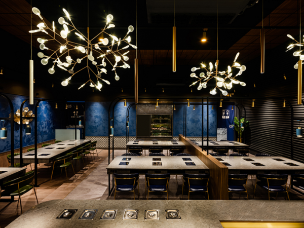
軟裝配置 留存情境 The furnishing feature save happiness ambience
軟裝配置計畫,在予人視覺停留及記憶暫存的想法上執行,大片藍染質調,掛以煙花燦爛的燈飾,搭襯外觀鐵皮黑幕,如夜色中的煙火,流光溢彩。木紋質調地坪、石材肌理桌面,凸顯白淨肉盤;熱氣蒸騰,熹微且暖,氤氳一室。
The furnishing scheme is planned with the idea of bestowing striking vision and happy memory to our customers. The texture of the Italy non-toxic blue paint wall, matches with the sparkling lighting, further assort with the black metal sheets; take the advantages of those elements just like fireworks in the night. The wood texture floor and the stone texture desktops highlight the white utensils and the steaming heat gently warm up the space.
OPEN Design 動能開啟傳媒:http://www.openworld.tv/talk/
分類選單
熱門推薦
最後更新時間:2020-05-22 15:16
熱門推薦
Loading


留言評論